Overview
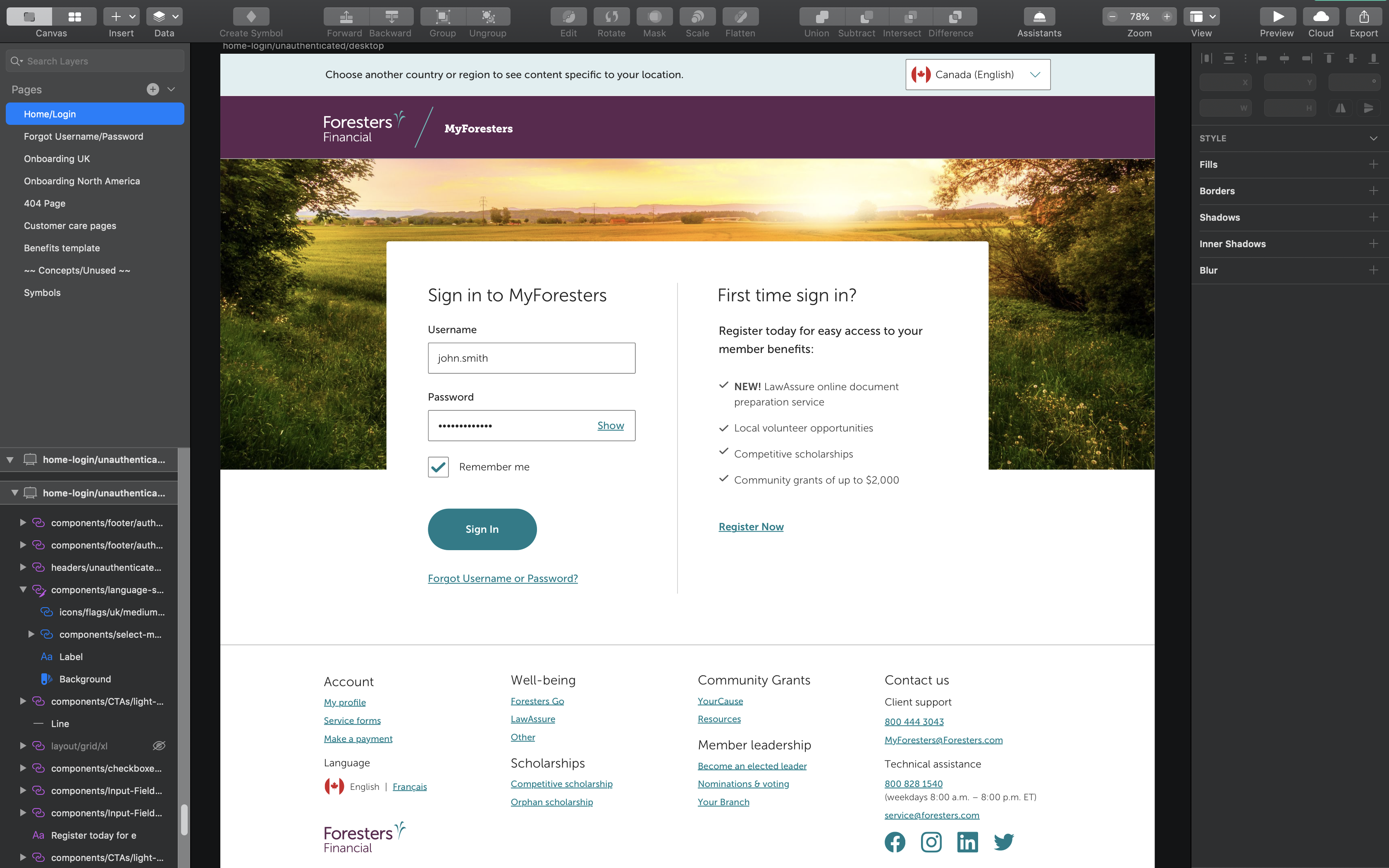
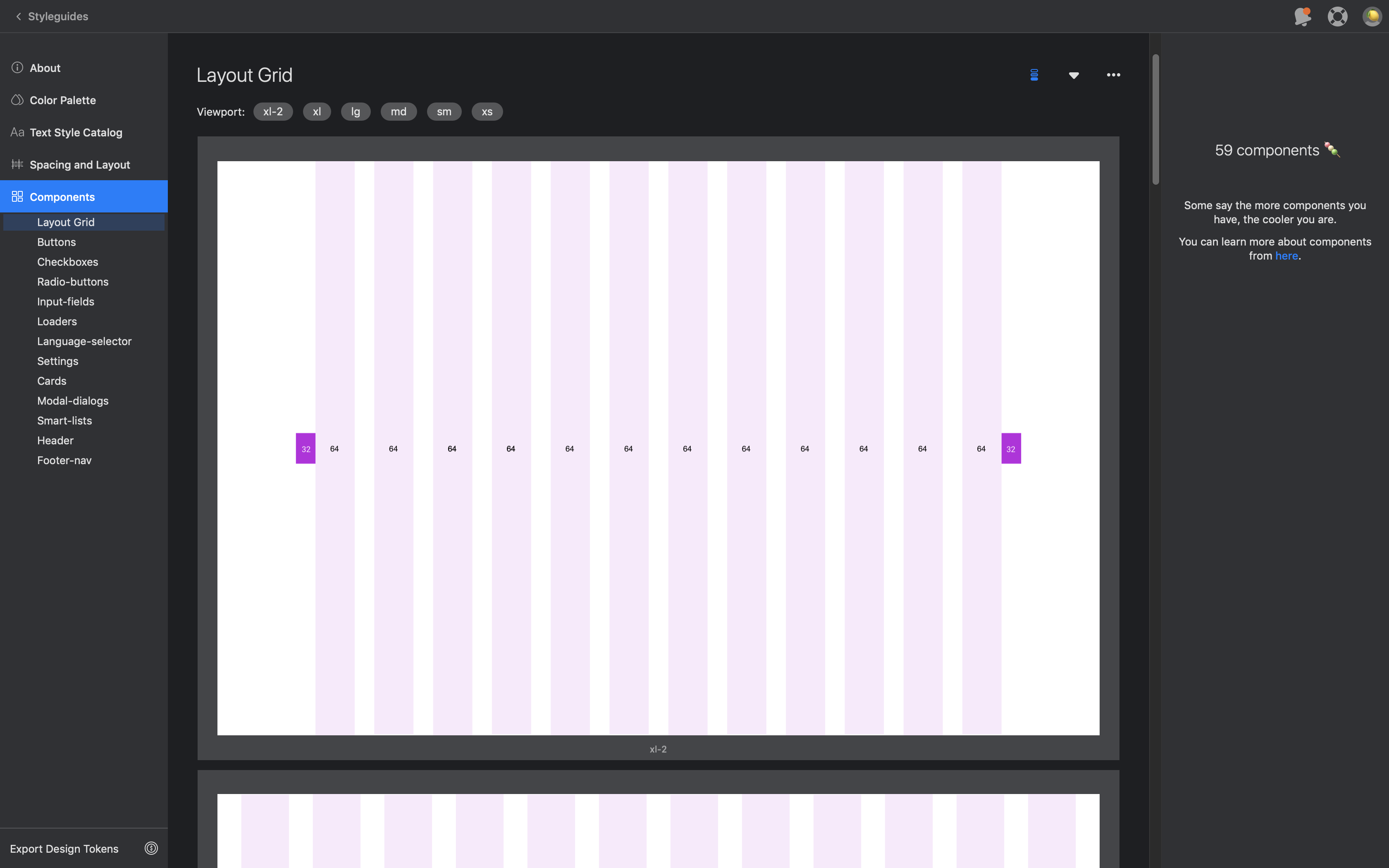
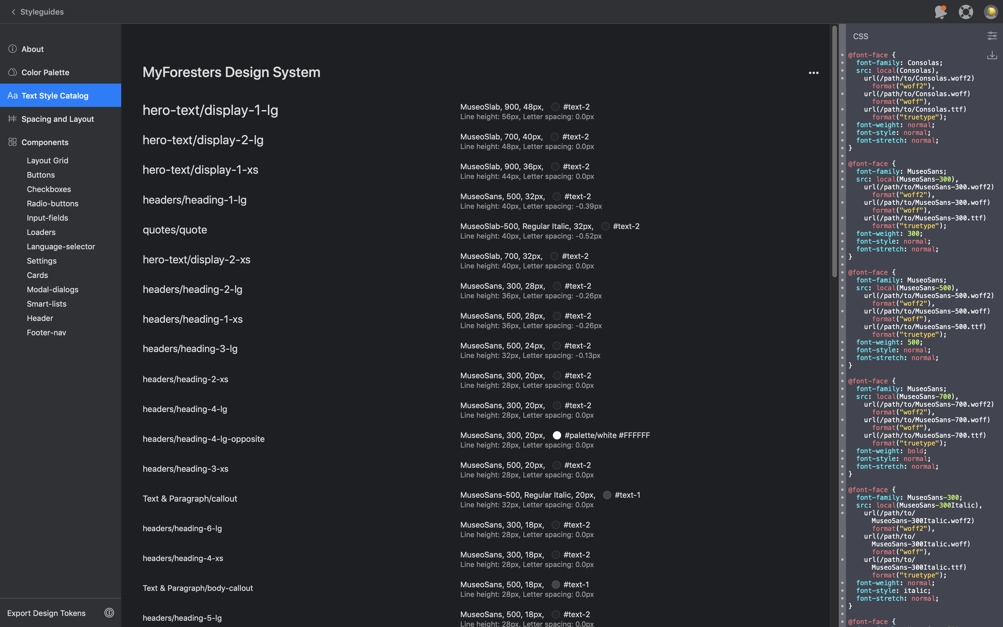
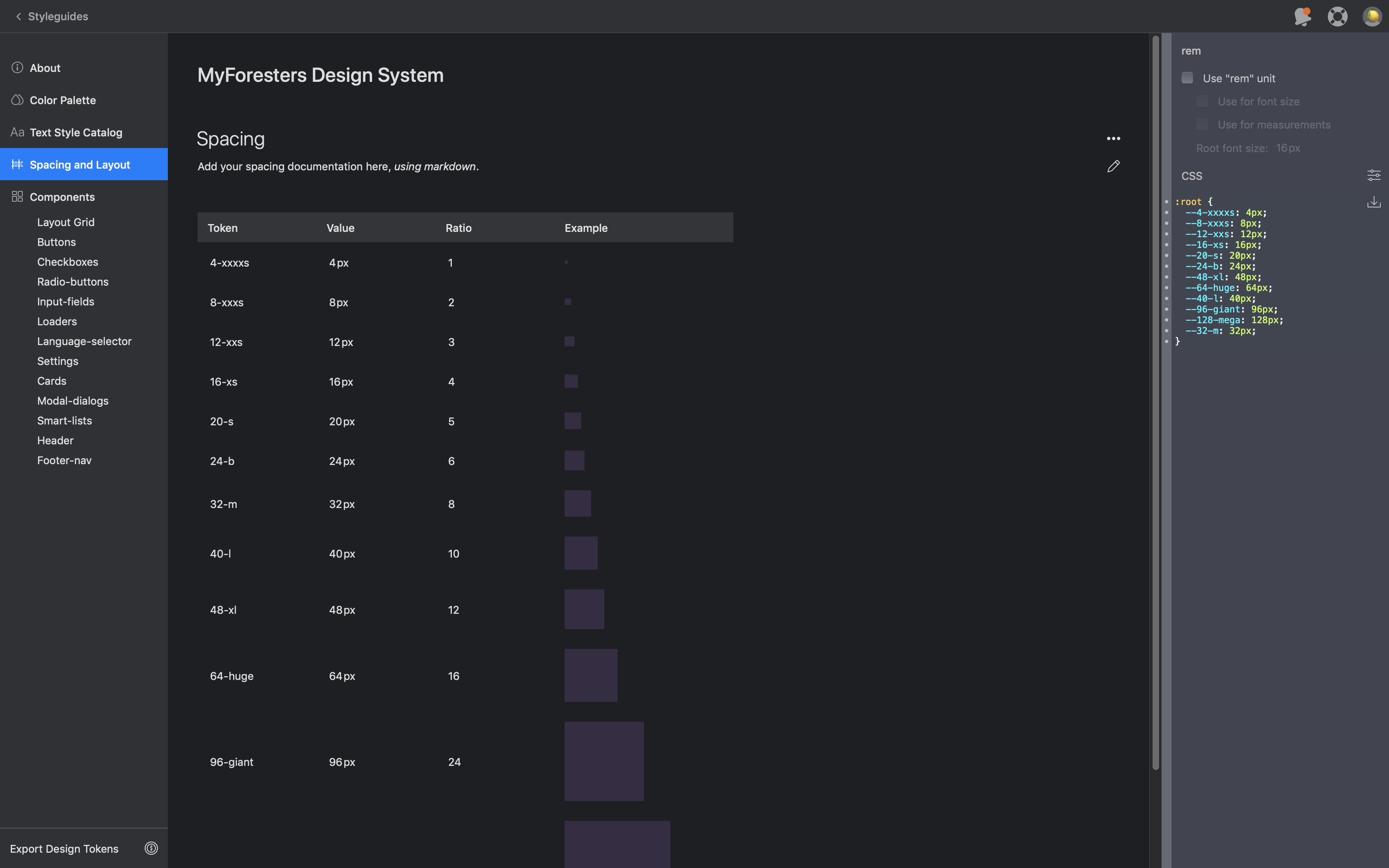
As UX/UI Designer on a medium-sized agile team, I was involved in the Discover > Define > Design > Testing phases of the project as outlined below. I was responsible for the end-to-end design cycle of all pages and UI patterns. This included the creation of wireframes, prototypes, high fidelity mockups, and the master Design System Sketch file. A case study can be reviewed below.
Goal
To provide Foresters members a better user experience to easily navigate and access member benefits on the MyForesters portal.
Our Approach
Due to the magnitude of the project a scrum approach was used to have the product built in a series of iterations. These sprints broke down big, complex tasks into bite-sized pieces.
Process
DISCOVER
Understanding MyForesters
As UX/UI Designer, it was key for me to understand the current the importance of the MyForesters portal and why it needed to be updated. Plenty of research into the current state of the portal, which helped identify issues with the user experience. Stakeholder interviews with BA’s helped define specific areas of need and guerrilla usability testing on other colleagues helped pinpoint areas of improvement in the experience.
DEFINE
Understanding the business and user needs allowed me to define the scope of work and create tasks that made sense for the design process. Great importance was placed on the design system as MyForesters would grow with new products over time, so creating a cohesive brand style guide for future use was a scaleable solution. Other areas of focus included improving responsive design, simplifying page content, and improving navigation.
DESIGN
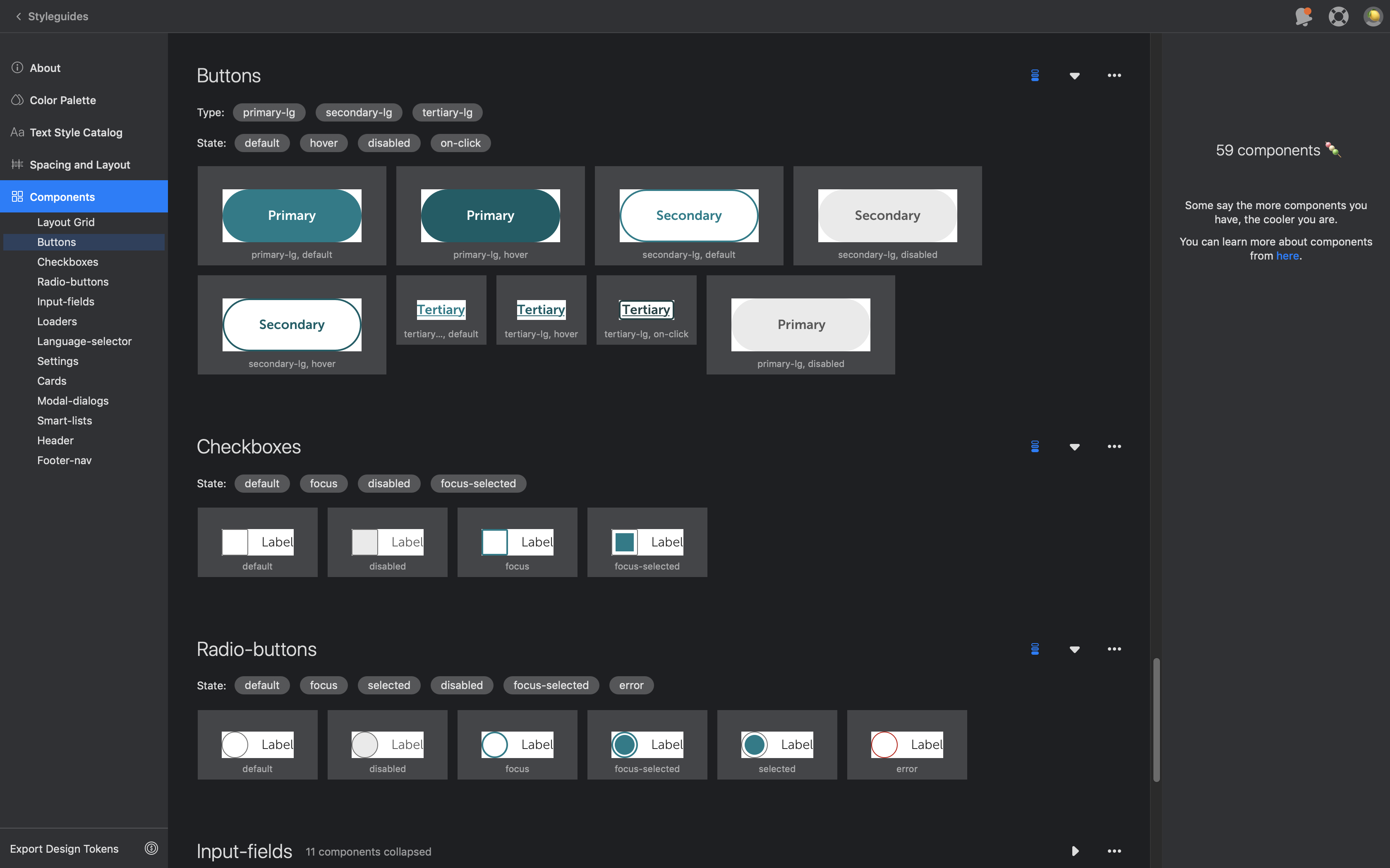
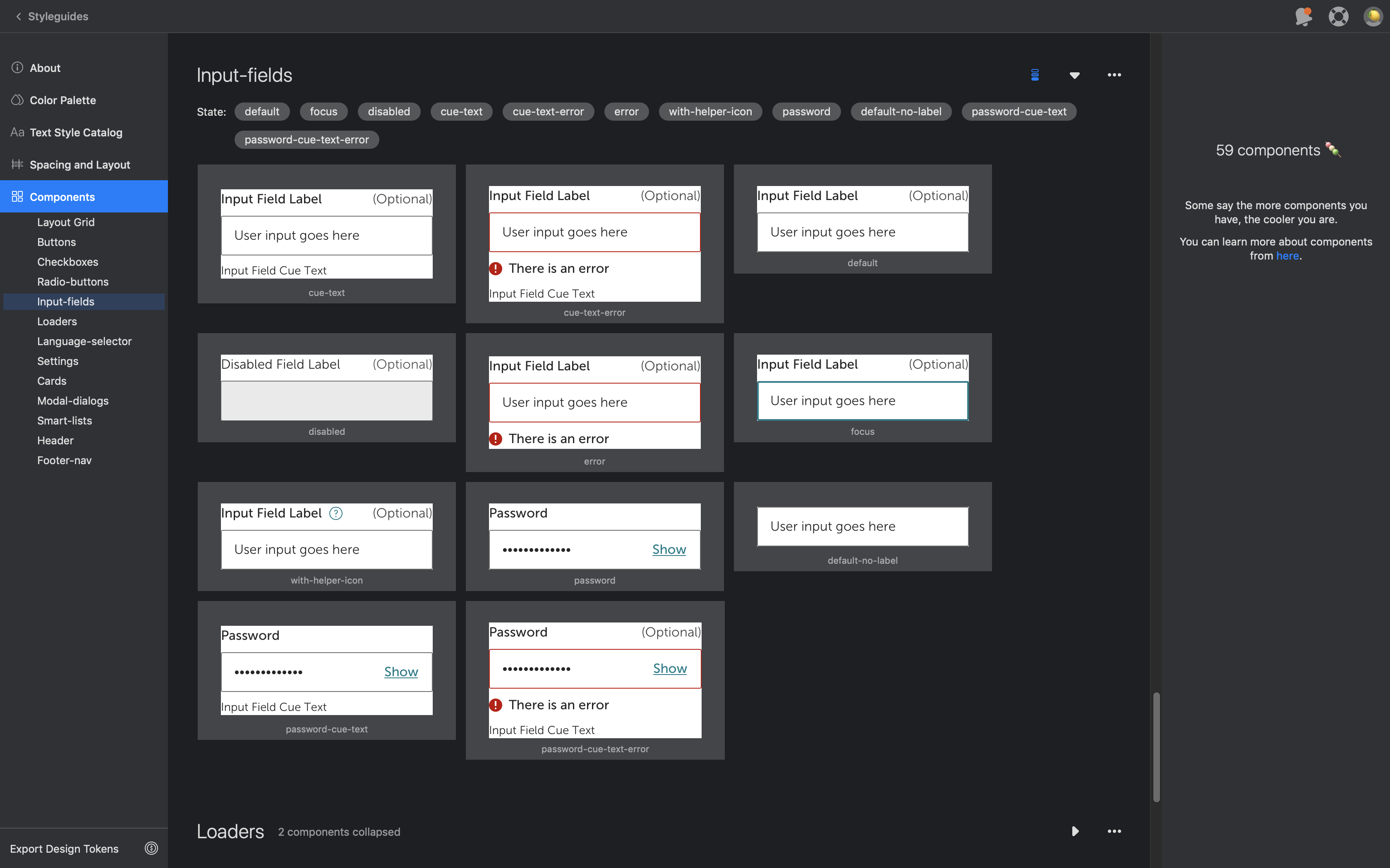
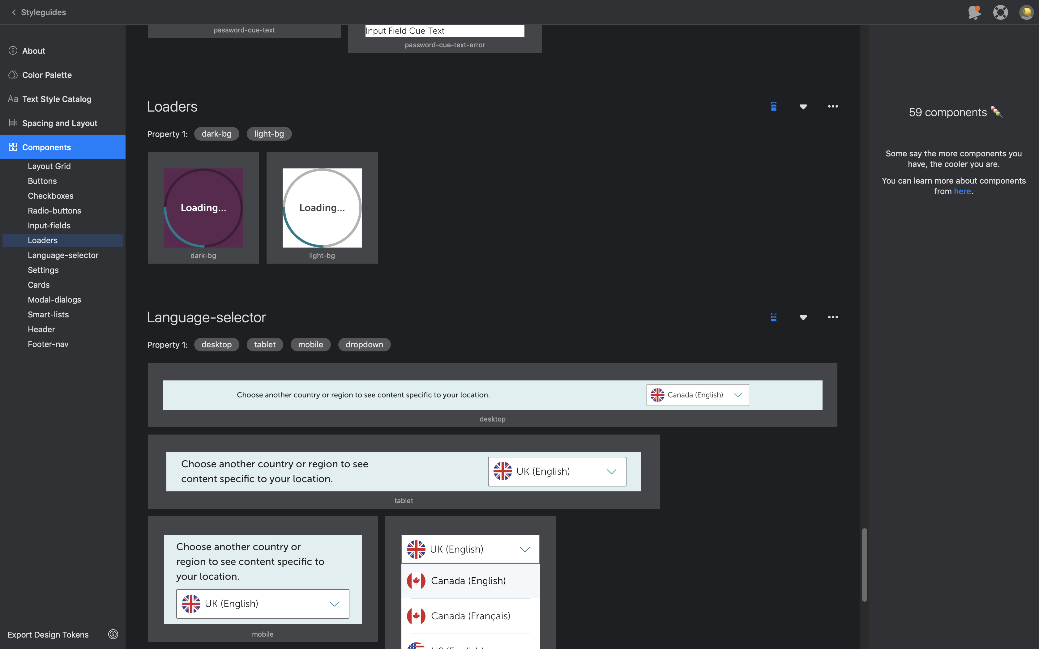
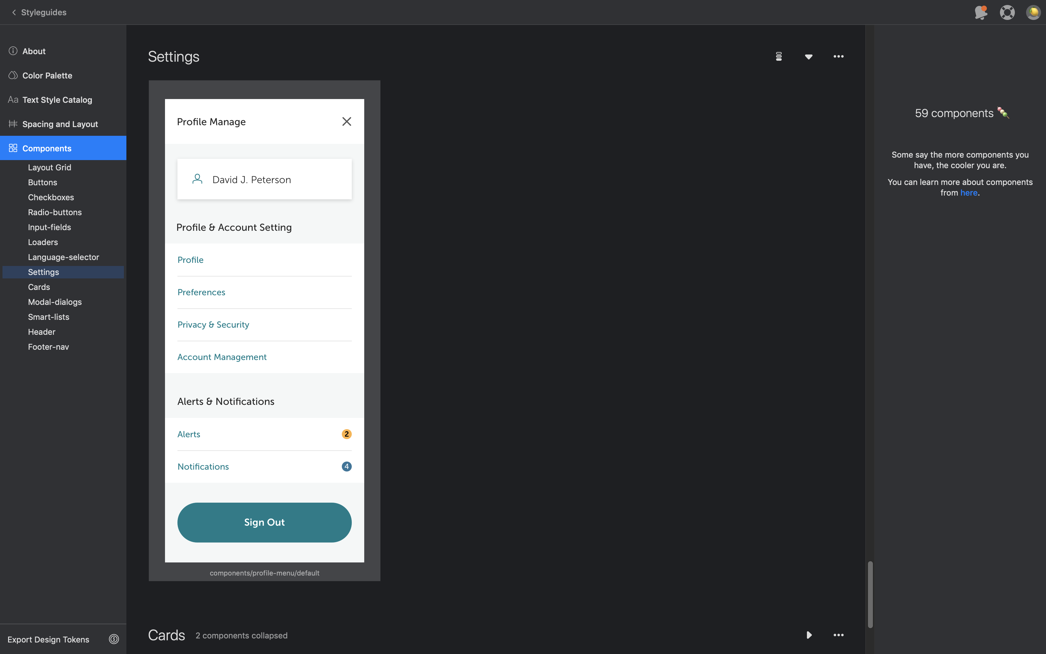
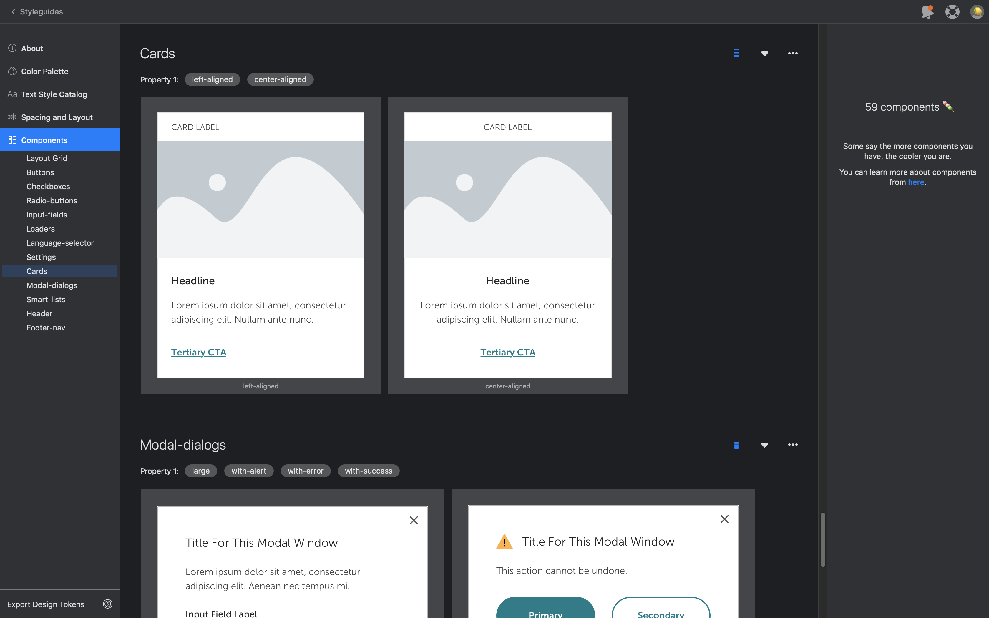
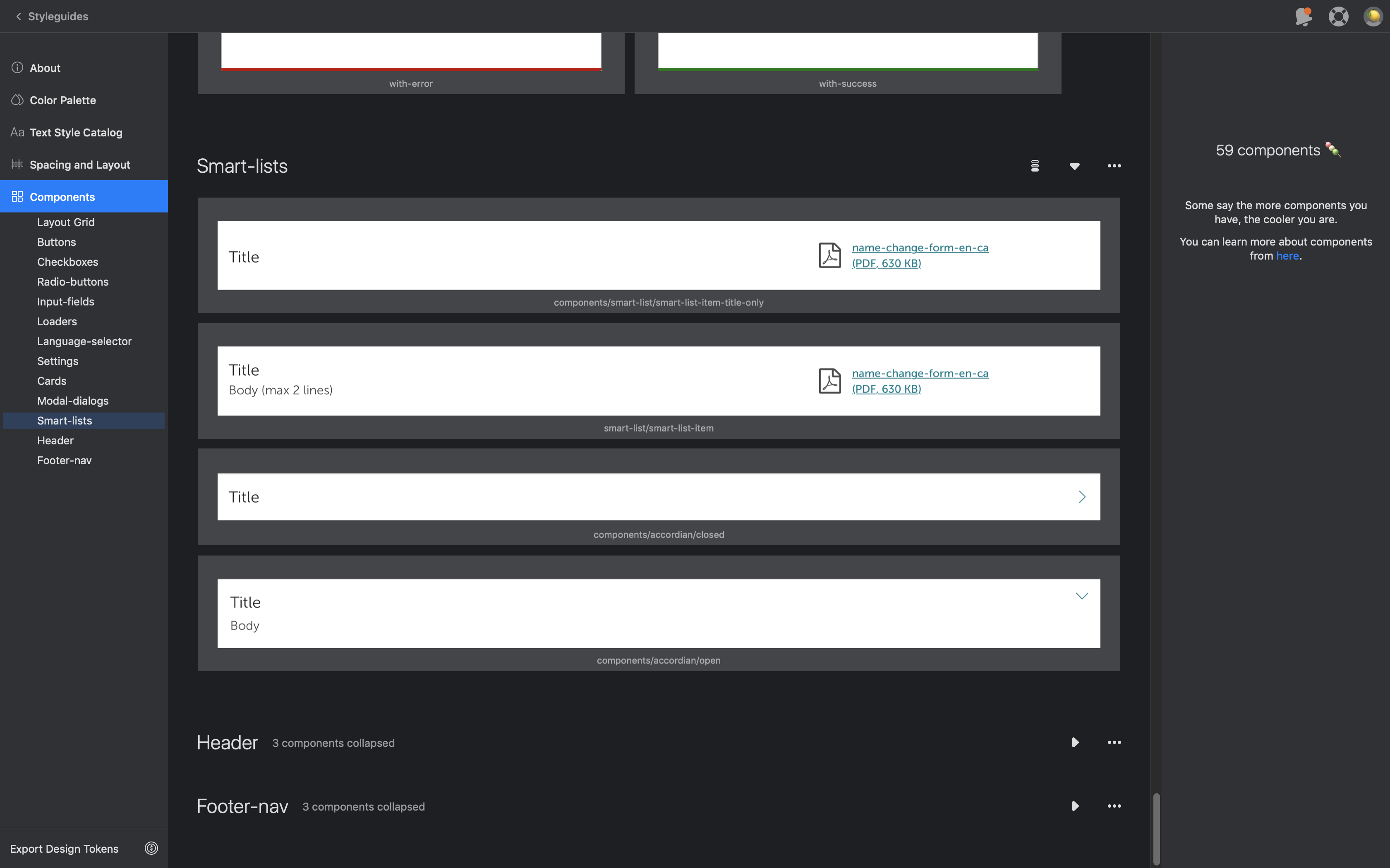
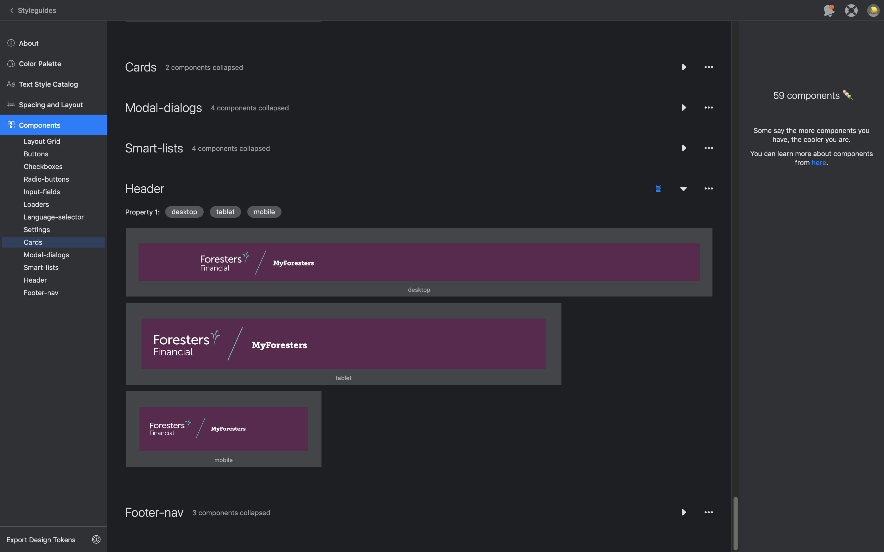
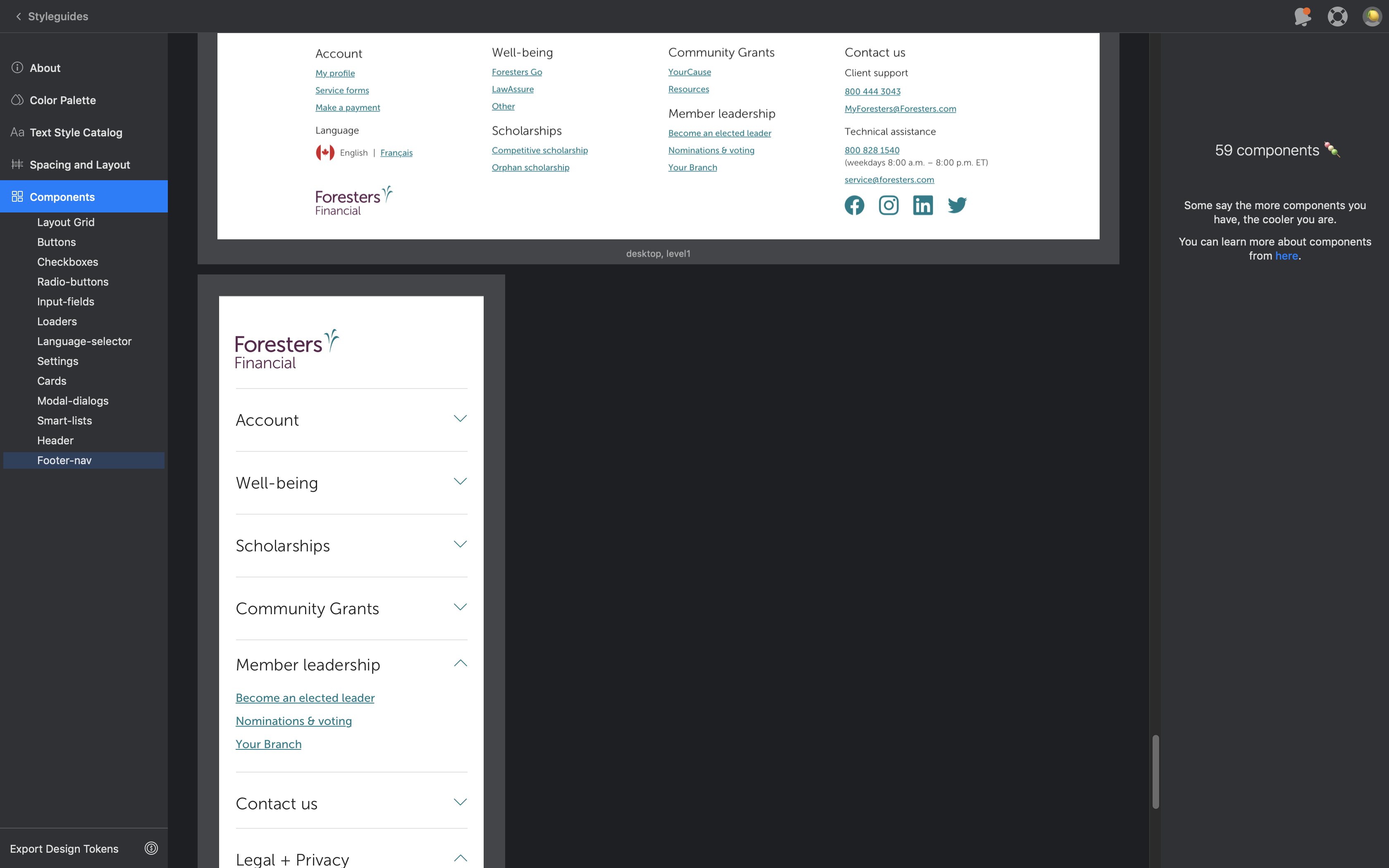
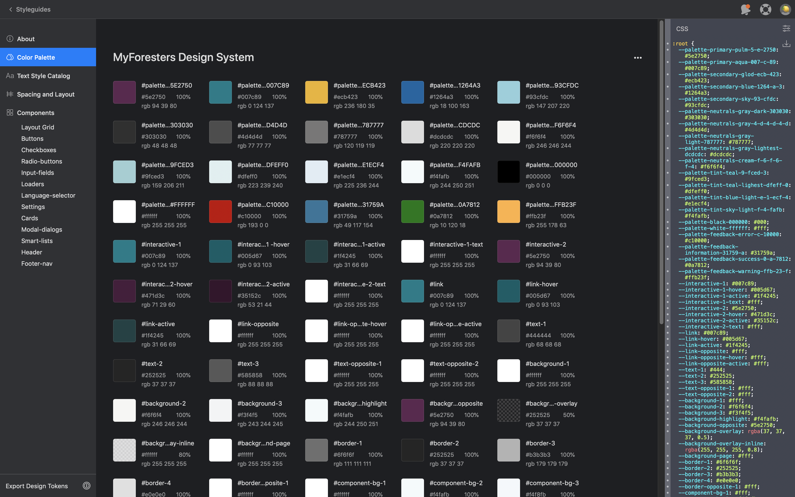
UI Design System Library
An organizational rebrand was in the works, so adding the Brand team as stakeholders was useful in aligning with the brand vision. I designed new UI elements within a master Sketch library and hosted the files onto Zeplin for meeting presentations and the developer handoff.
Prototype
I created a user flow of each step of the solution, which helped the team visualize the final results.
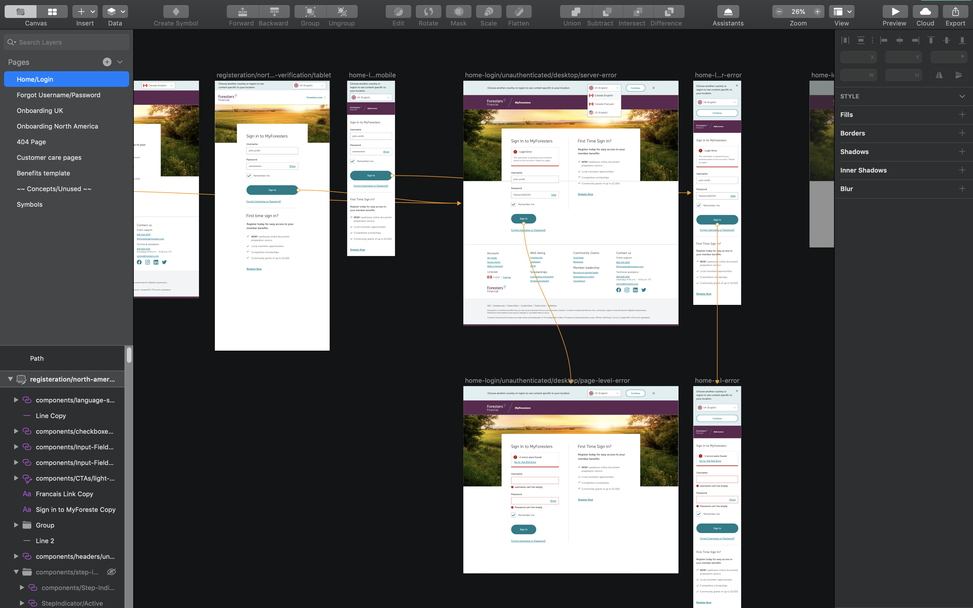
High-fidelity mockups
I created pixel-perfect designs of pages and UI elements, as well as case scenarios of how these elements would display (ie. alert box) if initiated by a user. This allowed developers to focus on the programming and refrain from design guesswork.
