DISCOVER
Stakeholder interviews
Gathering feedback and analytics from the Membership team was important in my research. Some of the questions asked were:
- What is the problem or need we are aiming to solve?
- What are the Key Performance Indicators (KPIs)?
- How else will we define success for this project?
- What are the users trying to do?
- What are their pain points?
- How can we reach users through this design process?
- Does a style guide exist?
Product audit
Navigating through the website and gathering metrics allowed us to see what was working and what wasn’t. It was clear that there were too many categories and tags that were not being effectively used. The Foresters Instagram channel could have a more prominent visual impact rather then just being an icon in the footer. The menu navigation was also overly complex and cumbersome. It could definitely be consolidated into a more digestible experience.
DEFINE
Sitemap
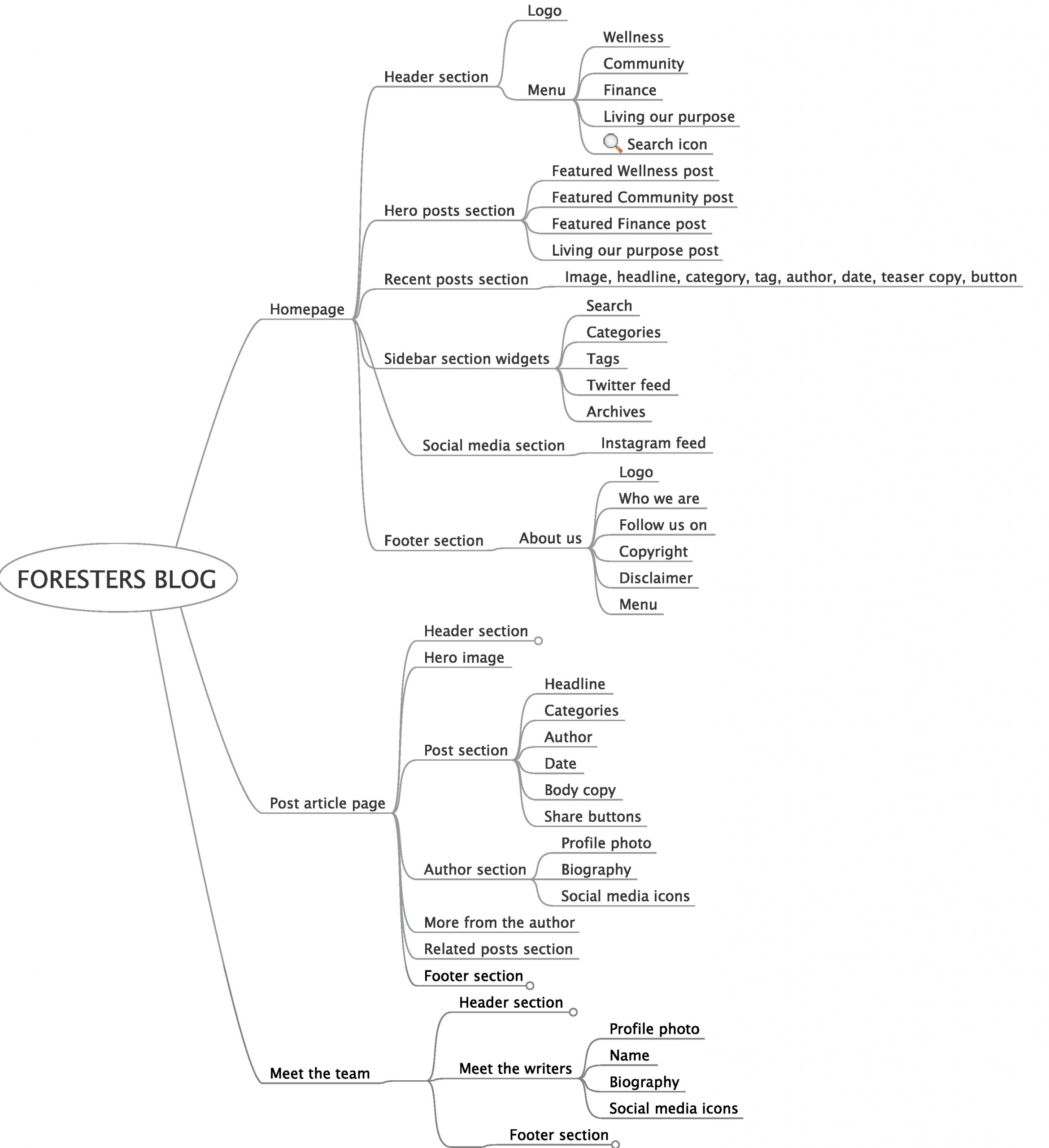
Based on our findings and constant back and forth with the stakeholders, I was able to create a site map of how the architecture of the site should be created. The different components for each page was also included on a sub-level.
DESIGN
Wireframes
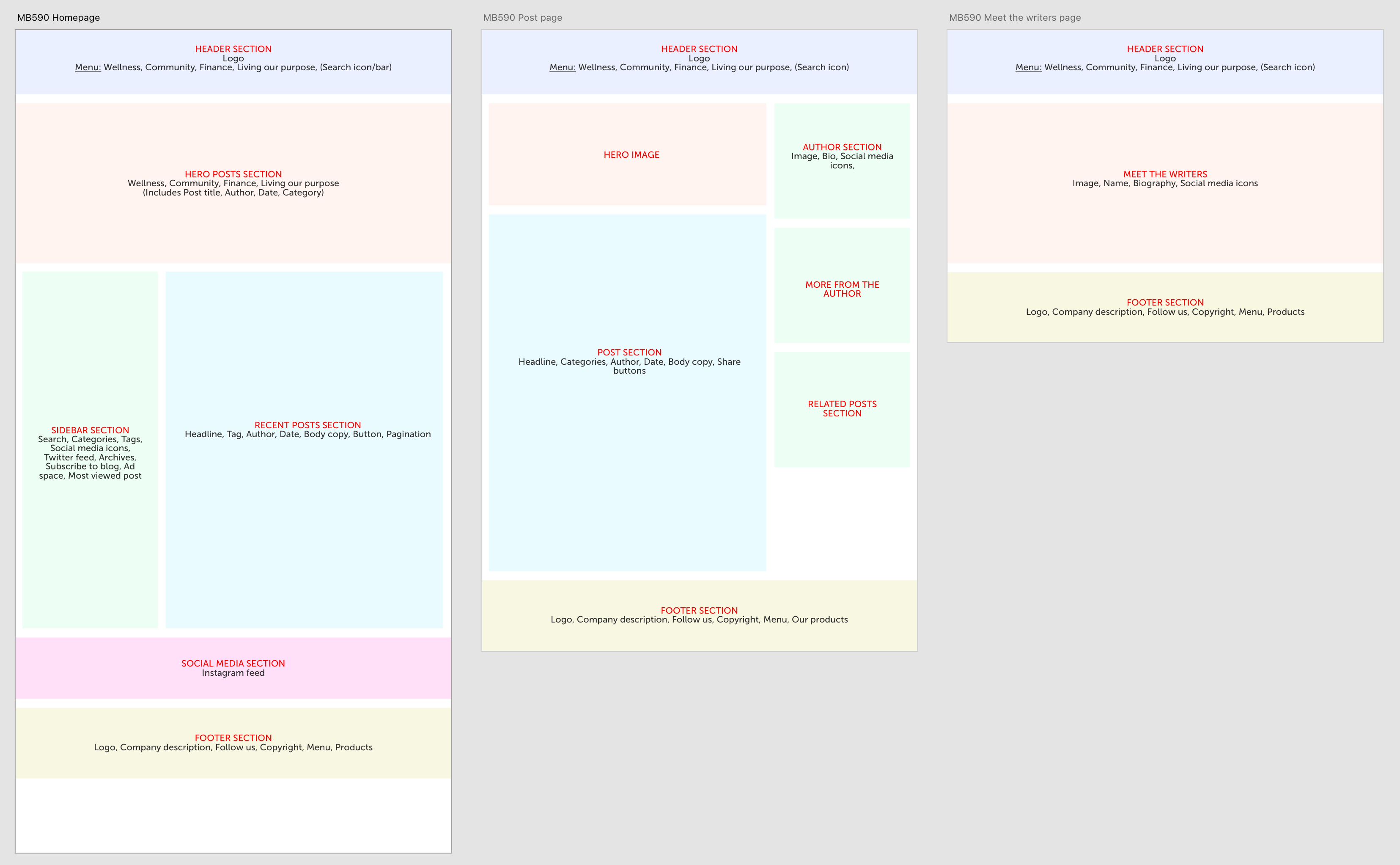
There were only three web templates that needed to be designed, which would than be repurposed throughout the site; homepage, post page and an author page (later replaced with a category page).
High-fidelity Mockups
Building mockups in accordance with WordPress standards and Foresters Brand Guidelines.
TESTING
A pretty straight forward solution with mainly guerrilla testing using colleagues to discover issues and bugs. My part of this process included CSS debugging.


